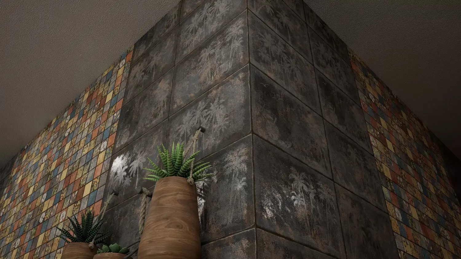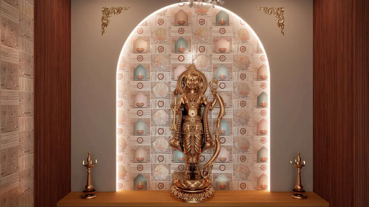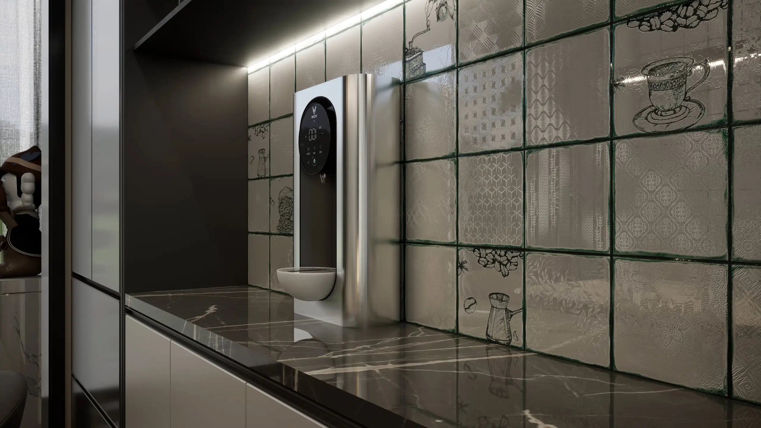

Wall tiles colour combinations: matching tiles with floors, paint, grout and furniture
How to combine tile colours with each other and with floors, wall paint, grout, cabinets and furniture: simple colour rules, combinations for each tile colour, and ideas for bathrooms, kitchens, living rooms, bedrooms and elevations.
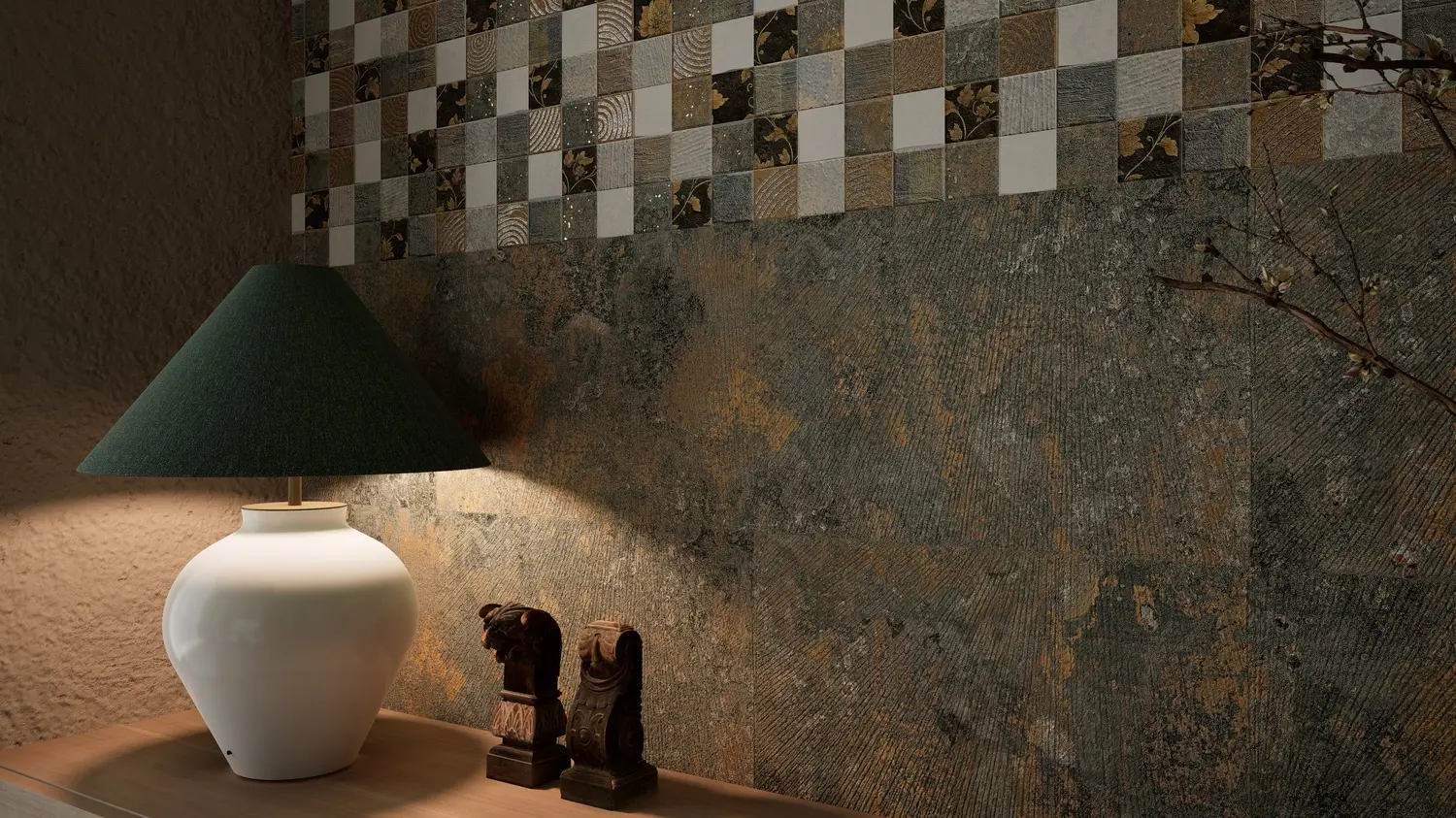
A tile rarely stands alone. It sits next to a floor, a painted wall, a kitchen cabinet, a bed or a front door, and the room works only when those colours work together. Most rooms that look wrong have good tiles in the wrong company: a warm beige next to a cold grey, a busy pattern against busy furniture, or a grout line that cuts a calm wall into a grid.
This guide gives simple rules for combining colours, then goes tile colour by tile colour and room by room with combinations that work. The examples use our own designs, but the ideas apply to any tile.
Three rules that solve most combinations
- 60-30-10. About 60% of a room in one main colour (often the walls or floor), 30% in a second colour (furniture, a feature wall or cabinets), and 10% in an accent (a decor band, cushions, lamps). It stops a room from feeling either flat or chaotic.
- Match the undertone. Every neutral leans warm (yellow, pink, red) or cool (blue, green, grey). Warm beige with cool blue-grey looks dirty; warm beige with warm cream or terracotta looks rich. Hold samples side by side in daylight to see the lean.
- One pattern leads. If the tile is patterned, keep the floor, paint and fabrics around it plain or textured. If the tile is plain, let the furniture, rugs or a decor panel carry the pattern.
Three ways to build a palette
- Tone on tone (monochrome): shades of one colour, such as cream, beige and sand. Calm and elegant, and the safest choice for small rooms. Add texture so it does not look flat.
- Neighbours (analogous): colours next to each other on the colour wheel, such as terracotta, orange and ochre, or blue, teal and green. Harmonious with more life than tone on tone.
- Opposites (complementary): colours across the wheel, such as blue and orange, or green and rust. Lively and bold. Use one as the main colour and the other only as an accent.
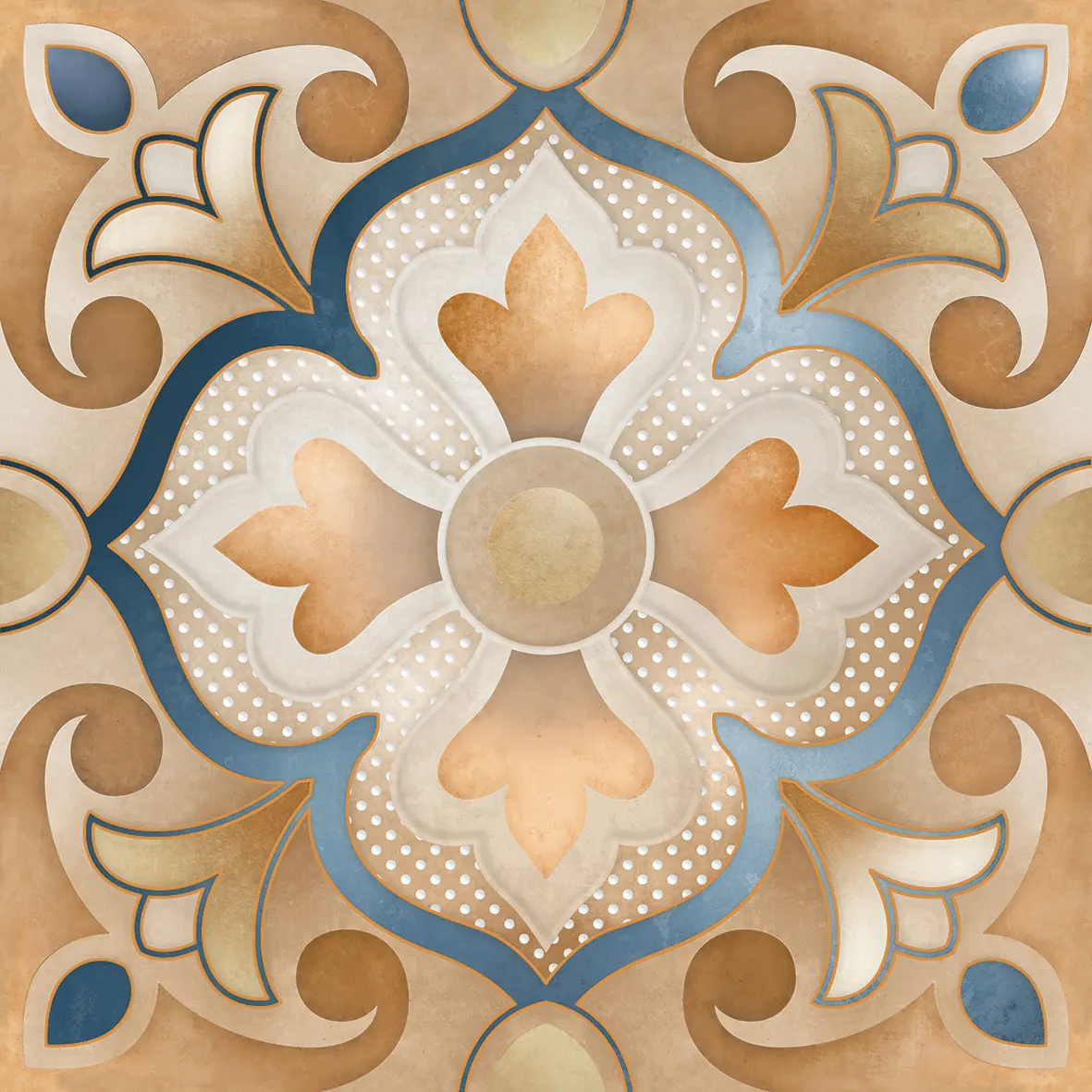
Many patterned tiles already contain a palette. Our Melisa Art Moroccan tile, for example, combines orange and dusty blue (opposites) on a sand ground; pull one of those colours out for the paint or furniture and the room comes together.

How colours feel
Colour changes the mood of a room before anyone notices the pattern. A rough guide:
| Colour | Feels | Works well in |
|---|---|---|
| White and cream | Clean, open, bright | Small bathrooms, kitchens, pooja rooms |
| Beige and sand | Warm, calm, safe | Living rooms, bedrooms, whole homes |
| Grey | Modern, cool, quiet | Bathrooms, offices, elevations |
| Terracotta and rust | Earthy, warm, welcoming | Living and dining rooms, terraces, cafes |
| Blue and teal | Fresh, cool, relaxing | Bathrooms, pool areas, kitchens |
| Green and sage | Natural, restful | Kitchens, bedrooms, balconies |
| Orange and yellow | Cheerful, energetic | Kitchens, dining areas, children's rooms |
| Black and charcoal | Dramatic, luxurious | Feature walls, powder rooms, bars |
In a hot climate, cool colours (blues, greens, greys) make a room feel fresher; in a room with little sun, warm colours (beige, terracotta, peach) make it feel cosier. North-facing rooms get cooler, even light; south and west-facing rooms get warm afternoon light that makes warm colours glow.
Combinations by tile colour
White and off-white tiles
White tiles go with almost anything, which is both their strength and their risk: a white room can feel clinical.
- Floors: warm wood-look, grey stone or a patterned black and white floor.
- Paint: sage green, dusty blue or warm grey on the walls above or beside the tiles.
- Grout: white for a seamless look, or dark grey or green for a graphic grid, like our Willow Kitchen, whose white glossy tile is printed with a dark green grid.
- Cabinets and furniture: wood, navy, sage green or black hardware.
- Accent: one patterned panel, brass taps, plants.
Beige, cream and sand tiles
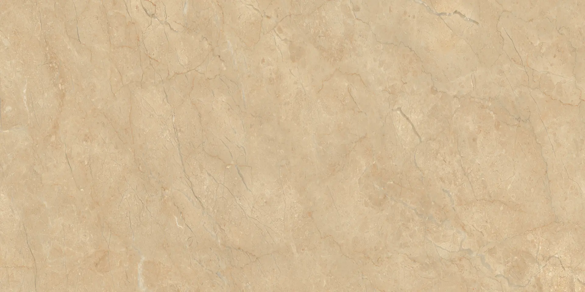
Beige is the most popular wall tile colour in India, because it is warm, forgiving and hides marks. The trick is to keep everything around it warm too.
- Floors: darker wood, warm brown or terracotta, or a lighter cream.
- Paint: warm white, ivory, peach, olive or terracotta.
- Accents: sage green, rust, gold and brass.
- Avoid: cool blue-greys and stark white next to it, which make beige look yellow.
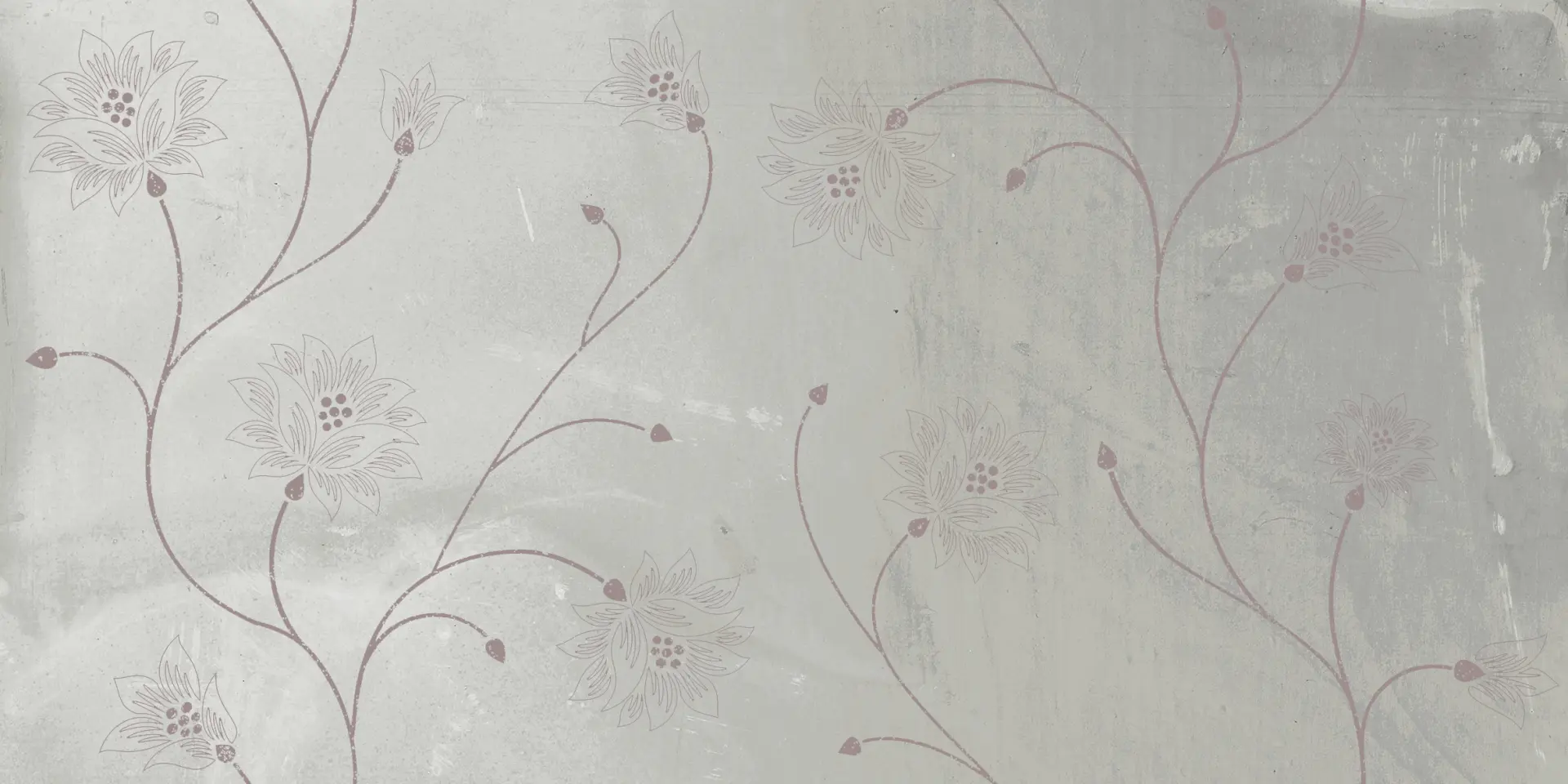
Our Velveno set shows the idea: a beige base with sage-green vines, plus navy and rust stripes as the accent.
Grey tiles
Grey can be warm (with a hint of beige, often called greige) or cool (with a hint of blue). Decide which you have first.
- Cool grey goes with white, navy, black, teal, chrome and light oak.
- Warm grey goes with cream, wood, terracotta, mustard and brass.
- Floors: a darker grey or charcoal floor under light grey walls grounds the room; white or light wood keeps it airy.
- Accents: yellow and mustard bring grey to life; blush pink softens it.
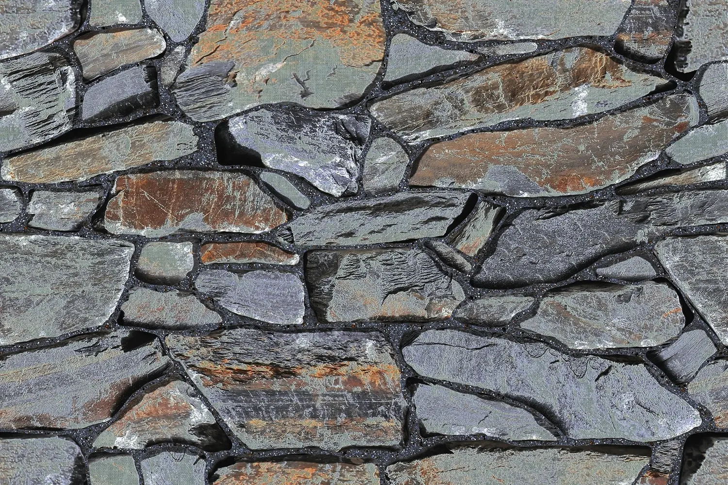
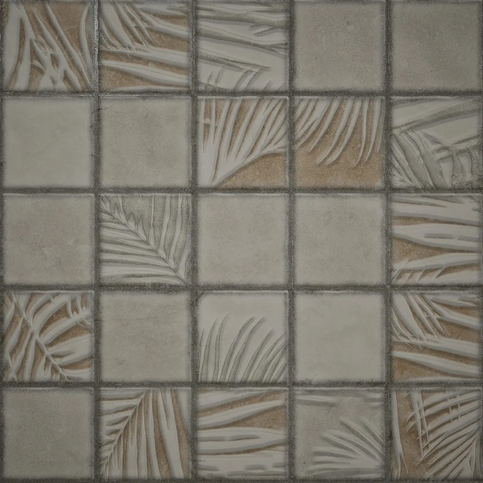
Grey stone looks such as Arritage Square and Mudy Stone pair beautifully with warm wood and green plants, indoors and out.
Terracotta, rust and peach tiles
Terracotta is warm and earthy and needs warm, natural company.
- Floors: cream, beige or a warm stone; dark wood.
- Paint: off-white, ivory, sand, olive or sage.
- Accents: teal and deep blue (opposites that make terracotta glow), olive green, brass and cane.
- Avoid: cool greys and bright white, which make terracotta look dull and orange.
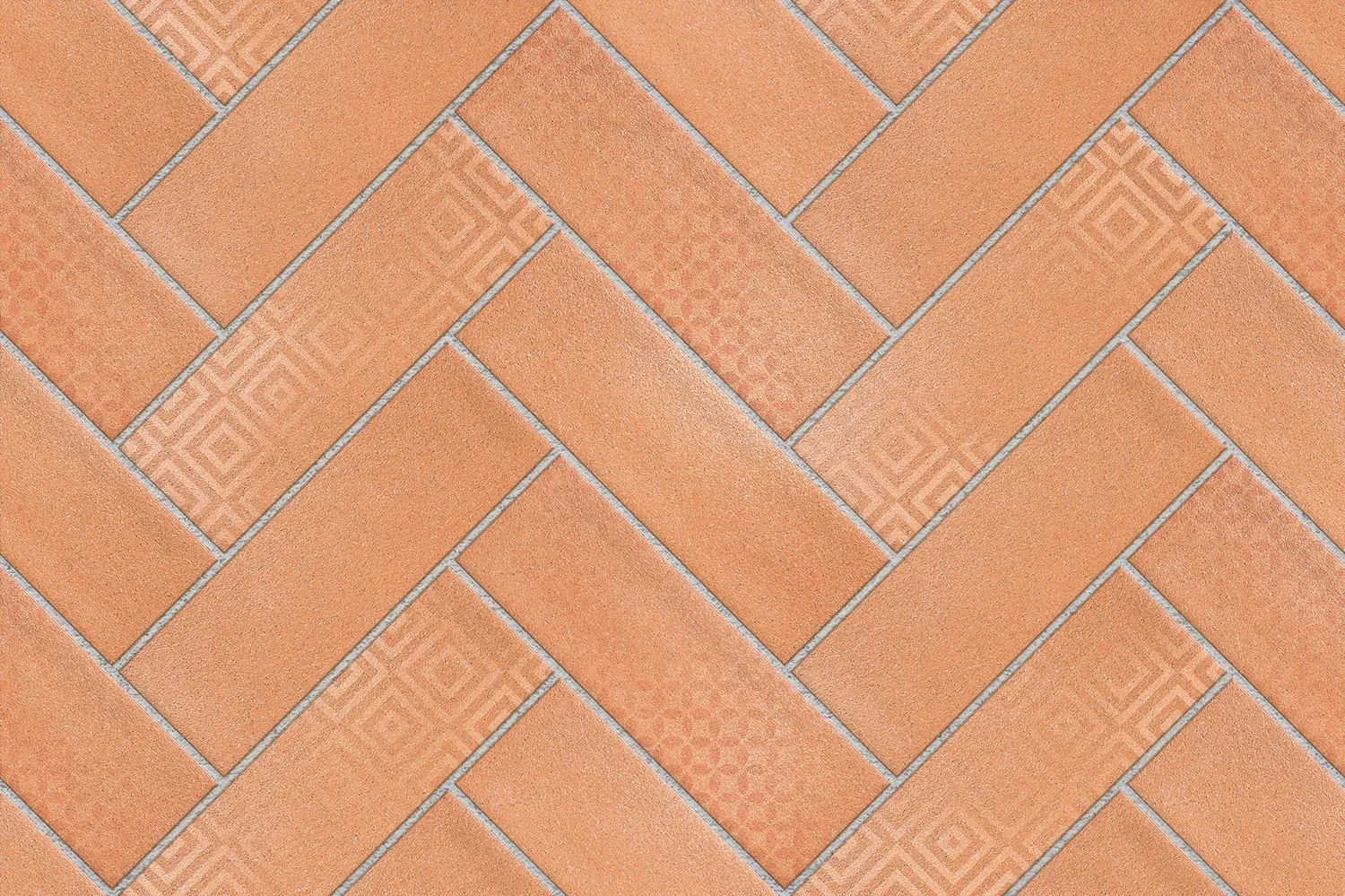
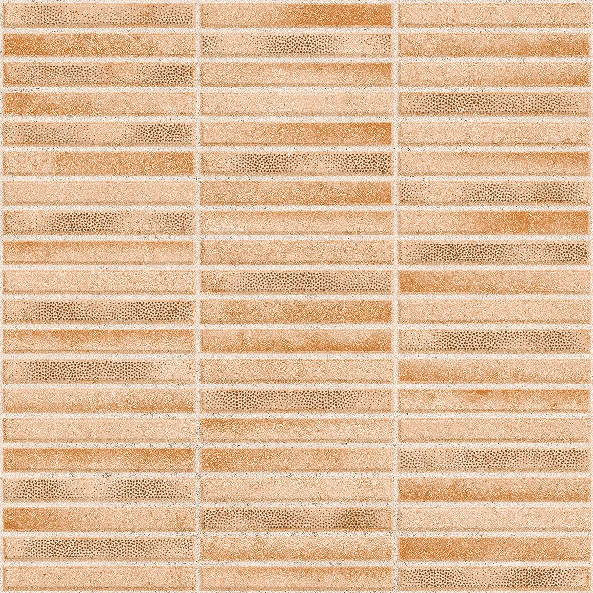
Our terracotta tiles guide has more combinations for Emola, Delice Bricks and Pigmento Beige.

Blue and teal tiles
- With white: fresh and clean, the classic bathroom and coastal combination.
- With terracotta, rust or orange: warm and lively; a teal wall with a terracotta floor is a Mediterranean favourite.
- With wood and brass: rich and calm, for kitchens and bars.
- With navy and grey: a calm, tone-on-tone blue room.
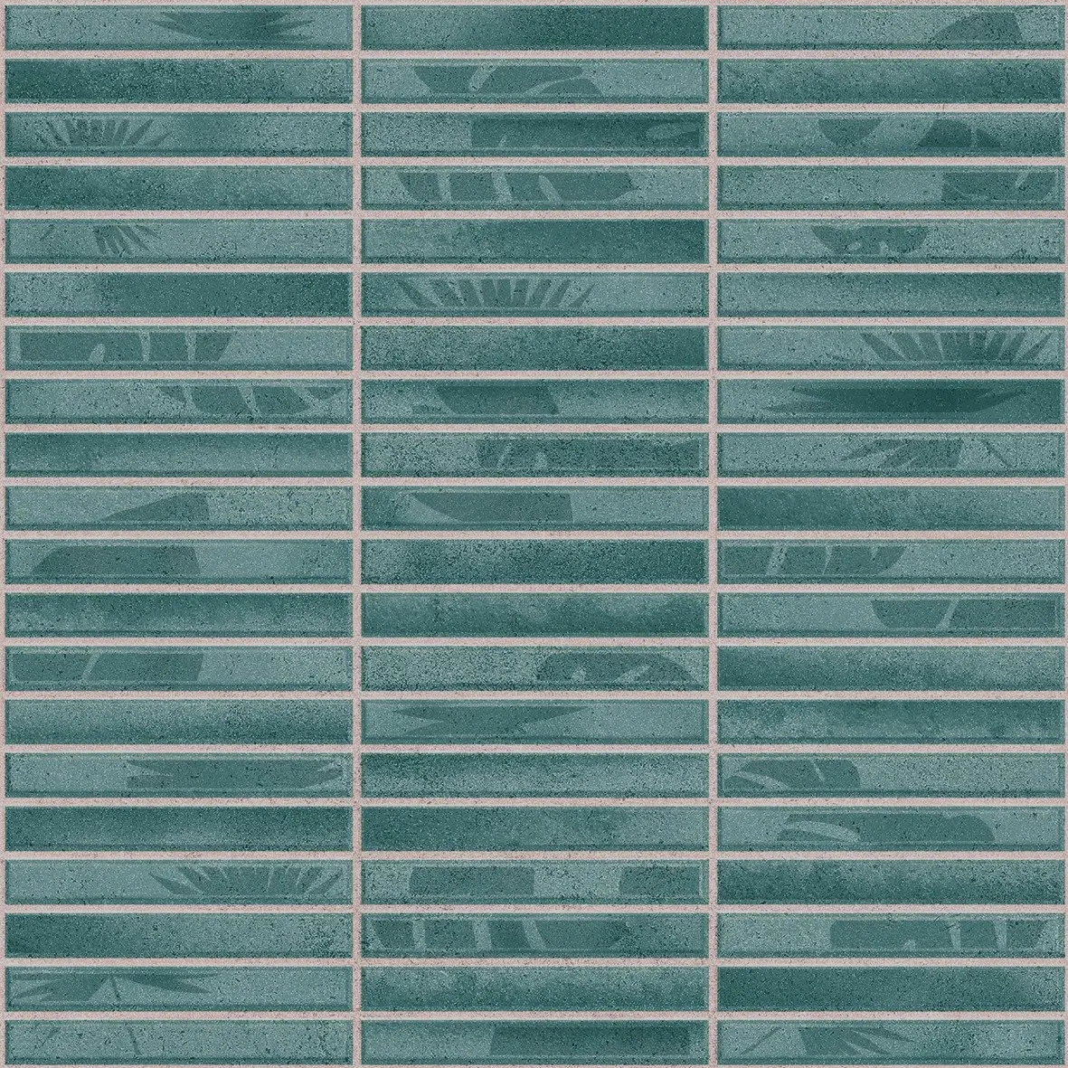
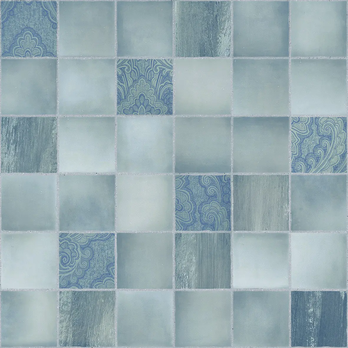
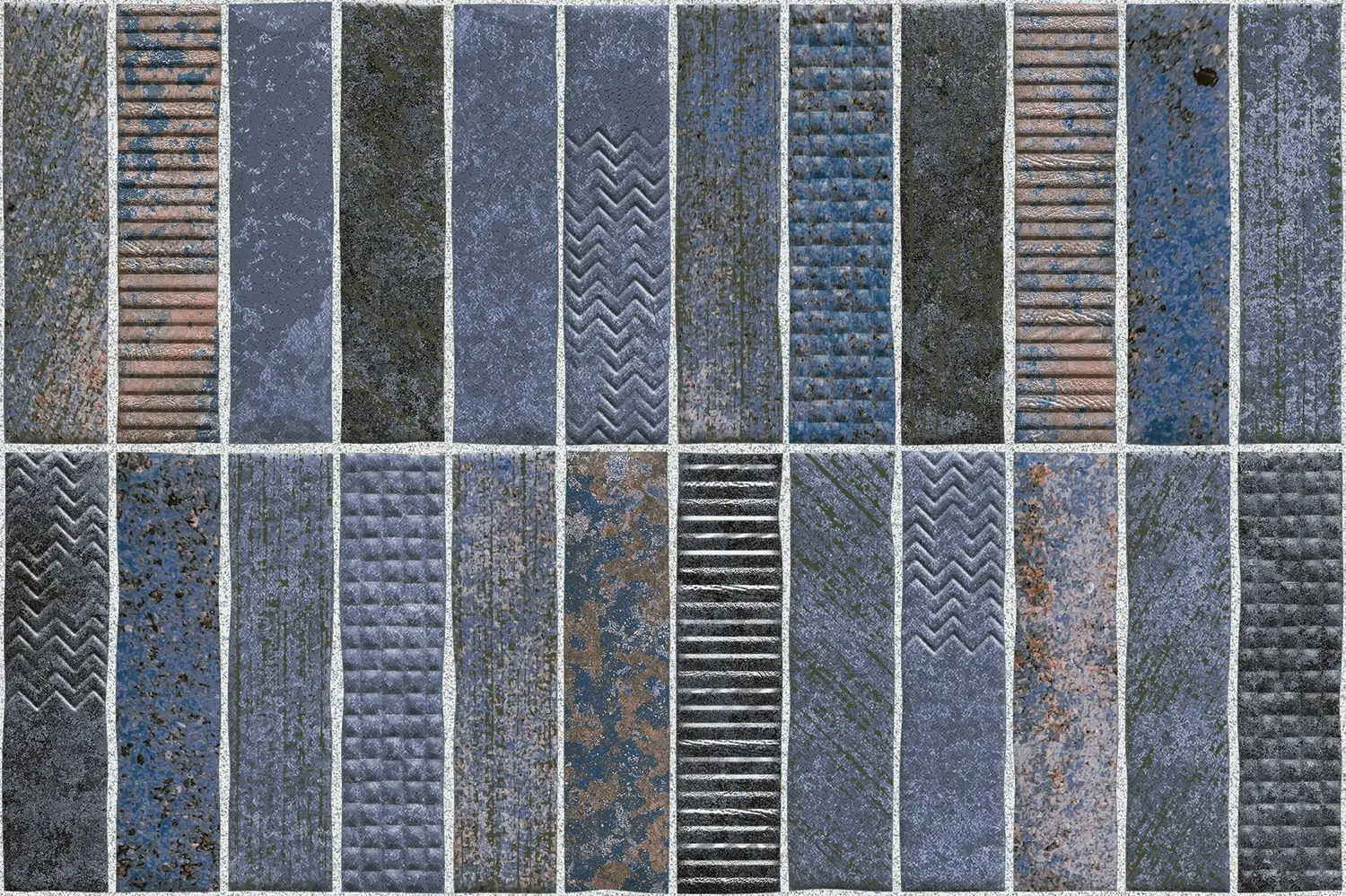
Examples: the teal strips of Pigmento Aqua, the blue mosaic look of Coliseo Azure and the denim and slate strips of Textura Mist.
Green and sage tiles
Green is the colour of the moment in kitchens and bathrooms.
- Sage and olive go with cream, warm white, wood, brass and terracotta.
- Mint goes with white, pale wood and rust.
- Deep green goes with brass, white marble looks and dark wood.
Our sage Greva Art herringbone and green Marmi Moroccan star tile both look best with warm metals and natural wood.
Black and charcoal tiles
Black adds drama and makes other colours look brighter, but it needs space and light.
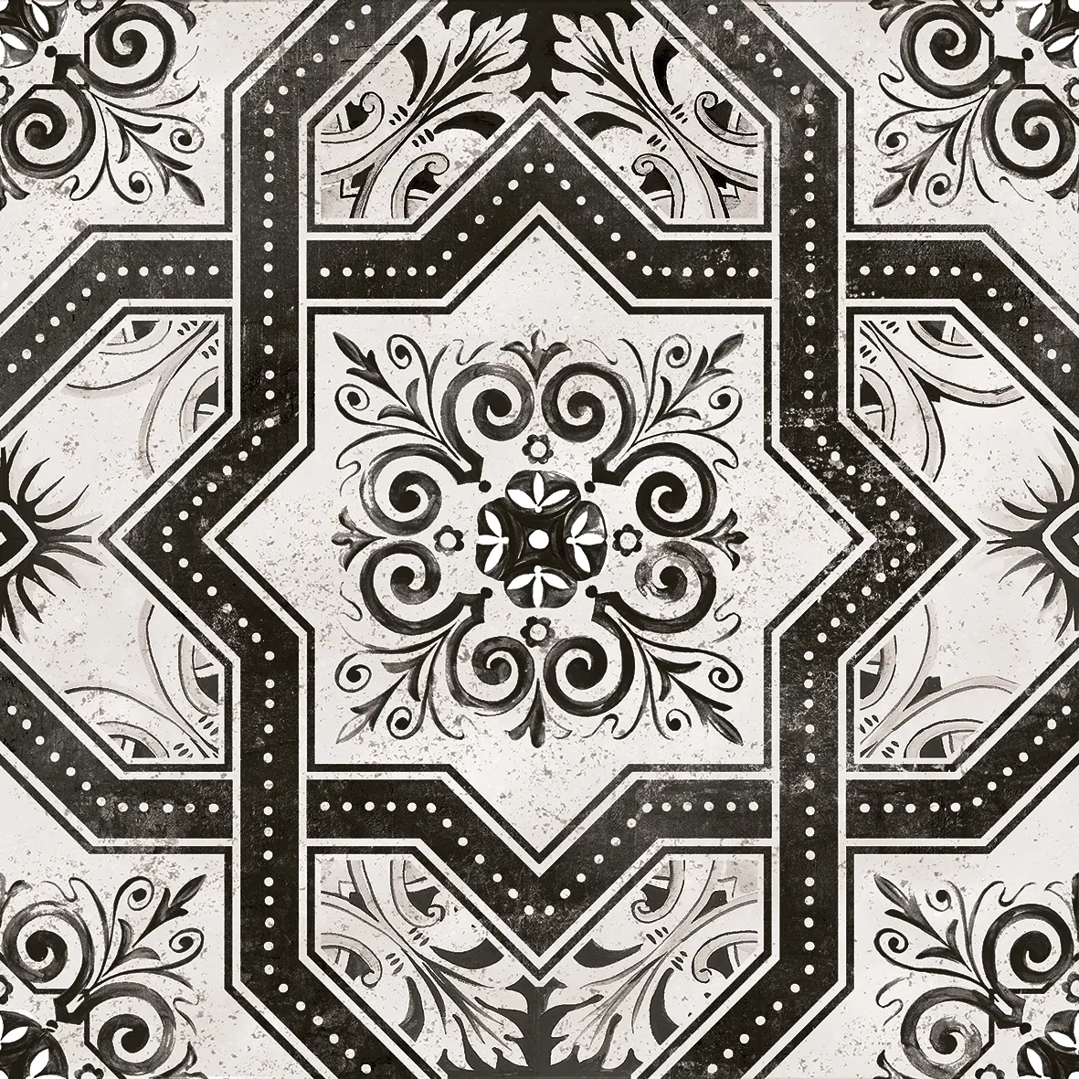
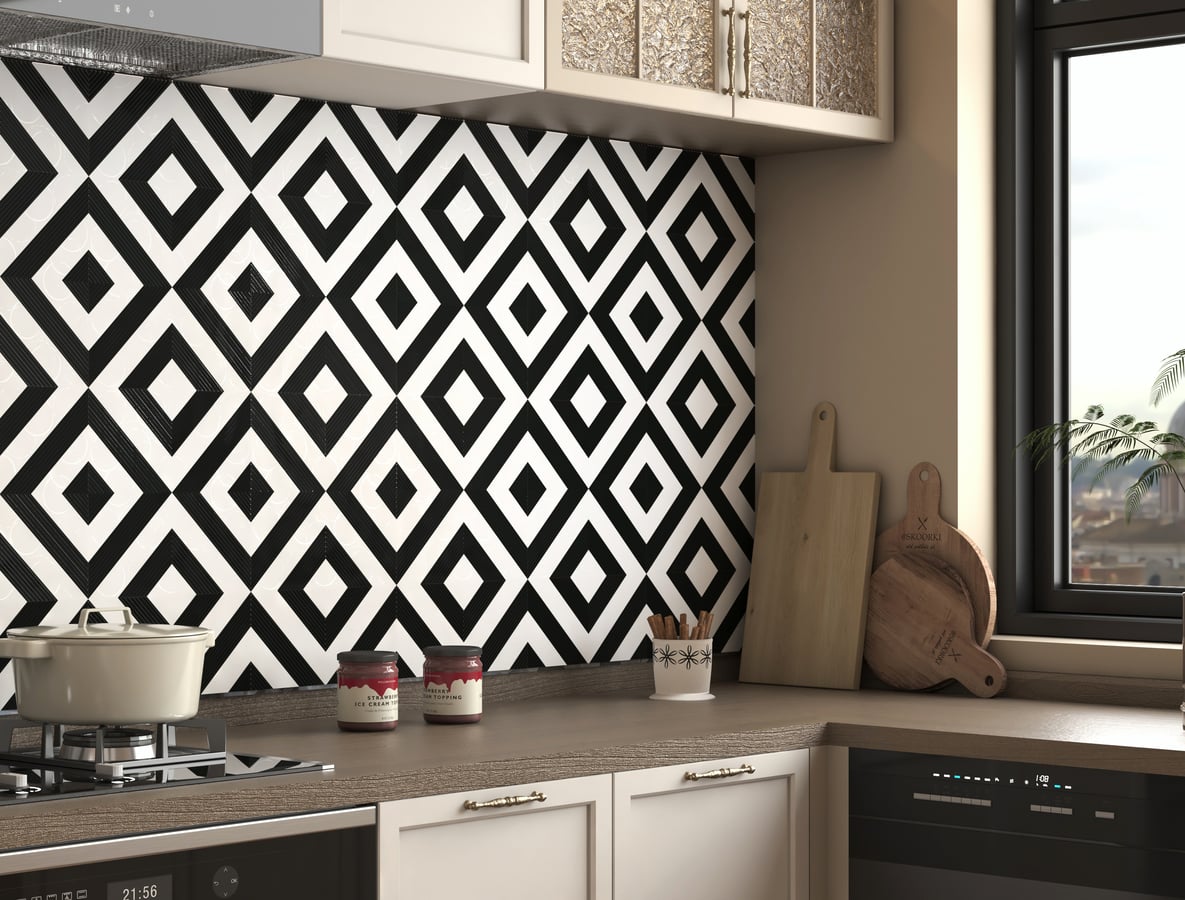
- Black and white: timeless and graphic. Our black and white tiles, such as BW 01 and Porto Fatima, work with white walls and wood or chrome.
- Black and gold or brass: luxurious; see the golden leaves on the charcoal stone of Clinker.
- Black and warm wood: softens black and makes it homely.
- Use black on one wall or the floor, with lighter surfaces around it, and plan good lighting.


Multicolour and patterned tiles
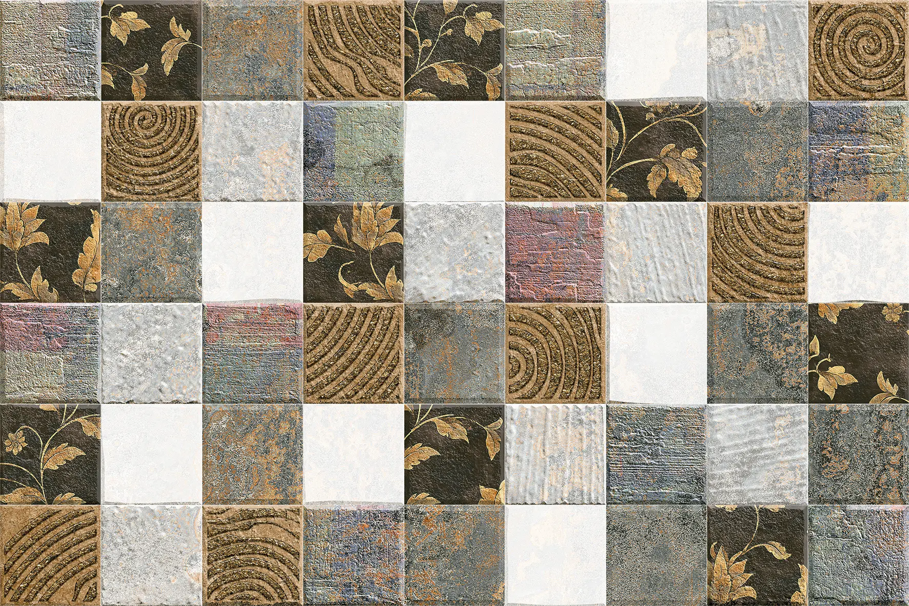
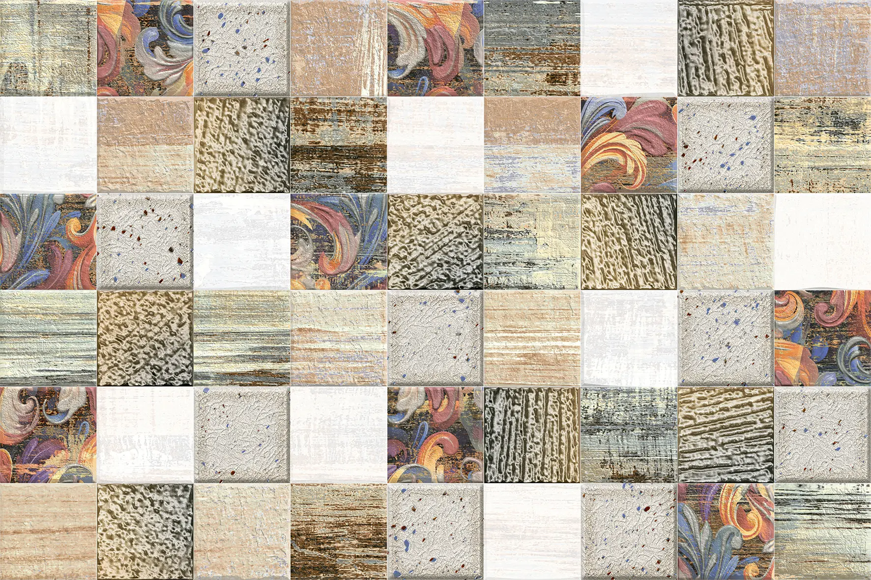
Pick the paint, furniture and accessories from the tile itself. Most patterns have a background colour, a main colour and one or two accents. Use the background for the walls and floor, the main colour for large furniture or cabinets, and the accents for small things. With a patchwork such as Nordic or Ronda, choose plain walls in one of its quieter tones.
Wall tiles and floor tiles together
- Contrast: a darker floor under lighter walls is the most common and the most comfortable: it grounds the room and makes the walls feel higher. A light floor with darker walls feels dramatic and works best in large, bright rooms.
- Continuity: the same colour family on walls and floor, in different shades or sizes, makes a small bathroom feel bigger.
- Pattern on one surface only: a patterned floor with plain walls, or a patterned wall with a plain floor. Two busy surfaces fight.
- Undertone: keep both warm or both cool.
| Wall tile | Floor that works |
|---|---|
| White | Grey stone, wood look, black and white pattern |
| Beige | Darker brown, terracotta, warm wood |
| Light grey | Charcoal, white, light oak |
| Terracotta | Cream, beige stone, dark wood |
| Blue or teal | White, terracotta, grey |
| Sage green | Cream, warm wood, terracotta |
| Black | White, light grey, warm wood |
Tiles and wall paint
When tiles cover part of a wall, the paint above or beside them matters as much as the tile.
- Pull a colour from the tile. For a patterned tile, use one of its quieter colours for the paint. For a stone or terracotta look, pick the lightest shade in the tile.
- Go a shade lighter. Paint one or two shades lighter than the tile's main colour keeps the tile as the feature.
- Match the undertone. Warm tiles with warm whites (ivory, cream); cool tiles with cool whites.
- Use the same white everywhere. Ceilings, trims and walls in one white make tiled rooms look planned.
Grout colour
Grout is a colour too, and on a wall of small tiles it covers a surprising area.
- Matching grout (the tile's background colour) makes the wall read as one surface. The usual choice for printed patterns that join across tiles, stone looks and feature walls.
- Contrasting grout outlines every tile, which suits plain white tiles in a retro or graphic style.
- Mid-grey grout hides kitchen and bathroom stains better than white.
- Warm grout (sand, beige) suits terracotta and wood tones; cool grey suits blues and greys.
Combinations room by room
Bathroom
| Main | With | Accent |
|---|---|---|
| White | Light grey stone floor | Navy or teal panel |
| Beige | Brown floor | Gold fittings, a botanical panel |
| Light grey | Charcoal floor | Black fittings, wood vanity |
| Aqua or blue | White | Brass or wood |
| Sage green | Cream | Brass, terracotta |
Light colours make a small bathroom feel bigger; save darker colours for a single wall or the floor. See the bathroom wall tiles guide.
Kitchen
| Backsplash | Cabinets | Counter |
|---|---|---|
| White with green grid | Sage green or wood | White or light stone |
| Mint hexagon on rust | White or natural wood | Grey or black |
| Sage herringbone | Cream or light wood | White |
| Teal strips | White or navy | Light wood or white |
| Orange and blue Moroccan | White | Black or grey |
Choose the countertop and cabinets first, then the backsplash, which can be bolder because it is a smaller area. See the kitchen wall tiles guide.
Living room
A feature wall behind the TV or sofa usually carries the room's strongest colour. Keep the other walls light and pick the sofa and curtains from the tile: beige and sage with Velveno, grey and gold with Sklep Orno Art, rust and teal with Burn Mont Art. See living room wall tiles.
Bedroom
Soft, warm combinations suit bedrooms: beige and terracotta, sage and cream, dusty blue and grey, or a single dark wall with light bedding. See bedroom wall tiles.
Pooja room
Cream, white and light yellow with gold accents are traditional; a beige devotional tile with brass lamps and a wooden mandir is a timeless combination. See pooja room tiles and tile colours as per Vastu.
Front elevation
Exterior combinations should suit the surroundings and the light:
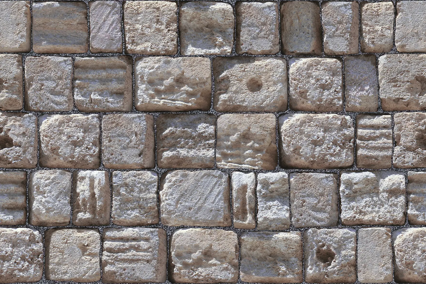
- Grey slate stone with white paint and dark wood or black window frames: modern and crisp.
- Red sandstone with cream paint: warm, traditional and very Indian.
- Ledger stone in rust and sand with off-white and bronze: earthy and contemporary.
- Stone look on the ground floor, paint above, with one material repeated on the boundary wall to tie the house together.
See the exterior elevation tiles guide.
Cafes, shops and offices
Commercial interiors use colour to set a brand's mood and to look good in photographs.
- Cafes and restaurants: warm terracotta, mustard and teal feel welcoming; a patterned counter front or feature wall, such as the circles of Eclipse Grove or the herbs of Bondy Relex, becomes the backdrop for customers' photos.
- Boutiques: a bold, colourful wall behind the counter and calm neutrals elsewhere, so the products stand out.
- Offices and receptions: greys, beige and soft green feel calm and professional; one patterned wall behind the reception desk carries the brand colour. Multi Mosaic is shown behind a hotel reception desk.
- Spas and pool areas: blues, aquas and white, with stone and wood.
Two-tone walls with base and decor sets
Our designer sets come with a plain base and one or more decor tiles that share its colour, which takes most of the guesswork out of combinations. A base in beige or grey covers most of the wall; the decor brings in the accent colours. Use the decor as a panel, a band or a single feature wall. Sets such as Velveno, Qubonic, Chevron and Belfist are in our designer wall tiles collection.
Mistakes to avoid
- Too many colours: more than three main colours in one room rarely works.
- Mixed undertones: warm beige beside cool grey.
- Two busy patterns side by side, or a busy tile with busy curtains.
- Choosing from a phone screen: screens change colours. Always look at a real sample.
- Choosing under showroom lights only: check samples in your own room, in daylight and at night.
How to test a combination
- Get samples of the tiles and paint cards for the walls.
- Put them together in the room, on the wall where they will go, not on a table.
- Look at them in the morning, afternoon and evening, with your own lamps on.
- Add a piece of the floor, counter or fabric you plan to use.
- Step back two or three metres: that is how you will see the wall.


Send us a photo of your room with the floor, furniture or paint you already have, and we will suggest designs that suit it. Contact us, or read designer wall tiles and highlighter tiles.