
Tile colours as per Vastu: a room-by-room and direction-by-direction guide
The colours Vastu Shastra traditionally suggests for each direction and room, how to use them in wall tiles, which colours and motifs to avoid where, and how to balance Vastu with a design you love.
Many Indian families plan a new home or a renovation with Vastu Shastra in mind, and tiles are one of the largest areas of colour in a house: bathroom and kitchen walls, the pooja room, a feature wall behind the bed, the floor and the front of the house. So it is natural to ask which tile colours Vastu suggests for each room.
This guide sets out the colours commonly recommended in Vastu for each direction and each room, and shows how to use them in wall tiles. Vastu traditions differ between schools and consultants, and the guidance here is the general, widely shared version. For a detailed plan of your own home, speak to a Vastu consultant; for the tiles themselves, we can help.
The idea behind Vastu colours
Vastu links each direction of a home to one of the five elements (panchatattva) and to a quality of energy. Colours are chosen to suit that element: earthy colours for earth, blues for water, reds and oranges for fire, whites and greys for air, and light, open colours for space. Broadly:
| Element | Directions | Colours |
|---|---|---|
| Water (jal) | North, north-east | Blue, sea green, white, light shades |
| Fire (agni) | South-east | Red, orange, pink, warm yellow |
| Earth (prithvi) | South-west, centre | Brown, beige, yellow, earthy tones |
| Air (vayu) | North-west | White, grey, cream, silver |
| Space (akash) | Centre (Brahmasthan) | White, off-white, light yellow |
A simple rule runs through most Vastu advice: light, calm colours for the north and east, which receive the morning light, and warmer, heavier, earthy colours for the south and west.
Colours by direction
| Direction | Commonly suggested colours | Usual rooms |
|---|---|---|
| North | Green, light blue, sea green | Living room, study, treasury |
| North-east | White, cream, light yellow, light blue | Pooja room, meditation space |
| East | White, light blue, light green | Living room, entrance |
| South-east | Orange, red, pink, peach, warm yellow | Kitchen |
| South | Red, coral, orange, brown | Bedroom, store |
| South-west | Beige, brown, earthy tones, peach | Master bedroom |
| West | Blue, white, grey | Children's room, dining, bathroom |
| North-west | White, grey, cream, light silver | Guest room, bathroom |
Use the table to guide the main colour of a room's tiles, then add patterns, accents and textures freely within that palette.
Pooja room tiles as per Vastu
The pooja room or mandir is ideally placed in the north-east, the most sacred direction in Vastu. The colours usually suggested are white, cream, light yellow and light blue: calm, pure colours that keep the space bright and peaceful. Avoid black, dark grey and heavy, dark red in the pooja room.
- Light wall tiles in white, cream or beige make the best background for the idols. Gold accents are considered auspicious.
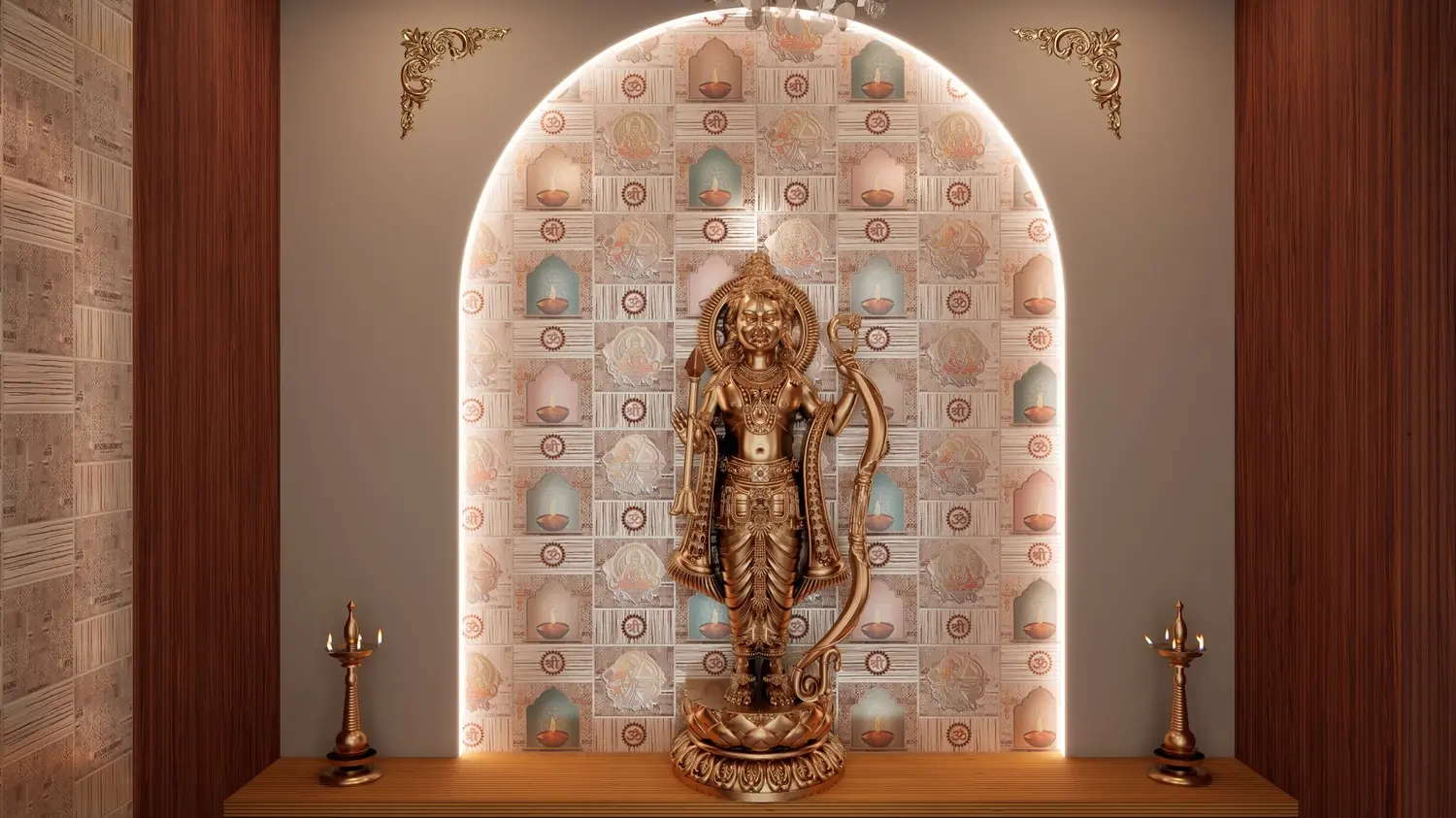
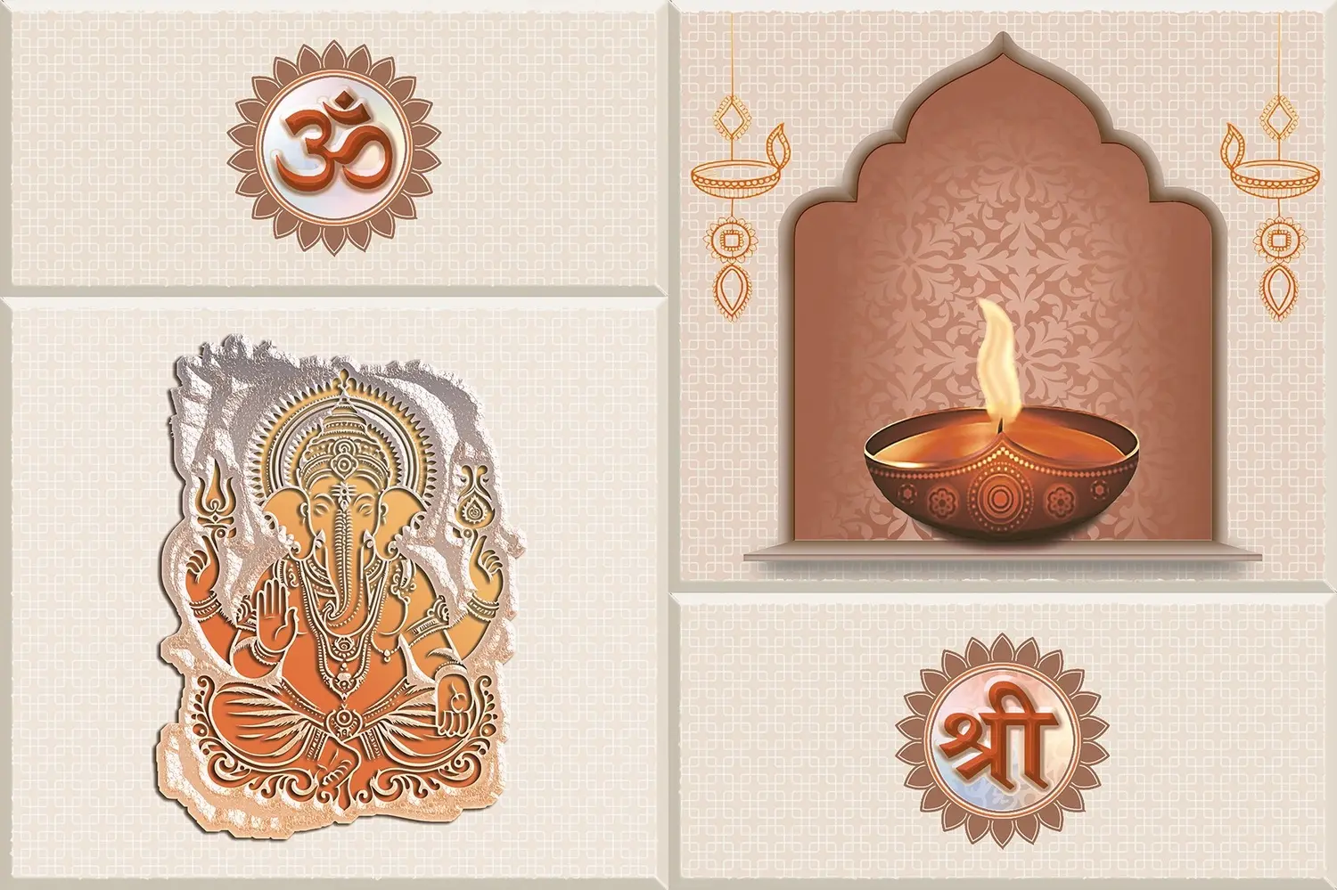
- Devotional tiles carrying Om, Shree, Lord Ganesh, Lord Ram or a mantra turn the wall itself into the backdrop. Our Divyam God set has Lord Ganesh, Lord Ram, Om, Shree and a lit diya in a temple arch, with a patterned beige tile around them.
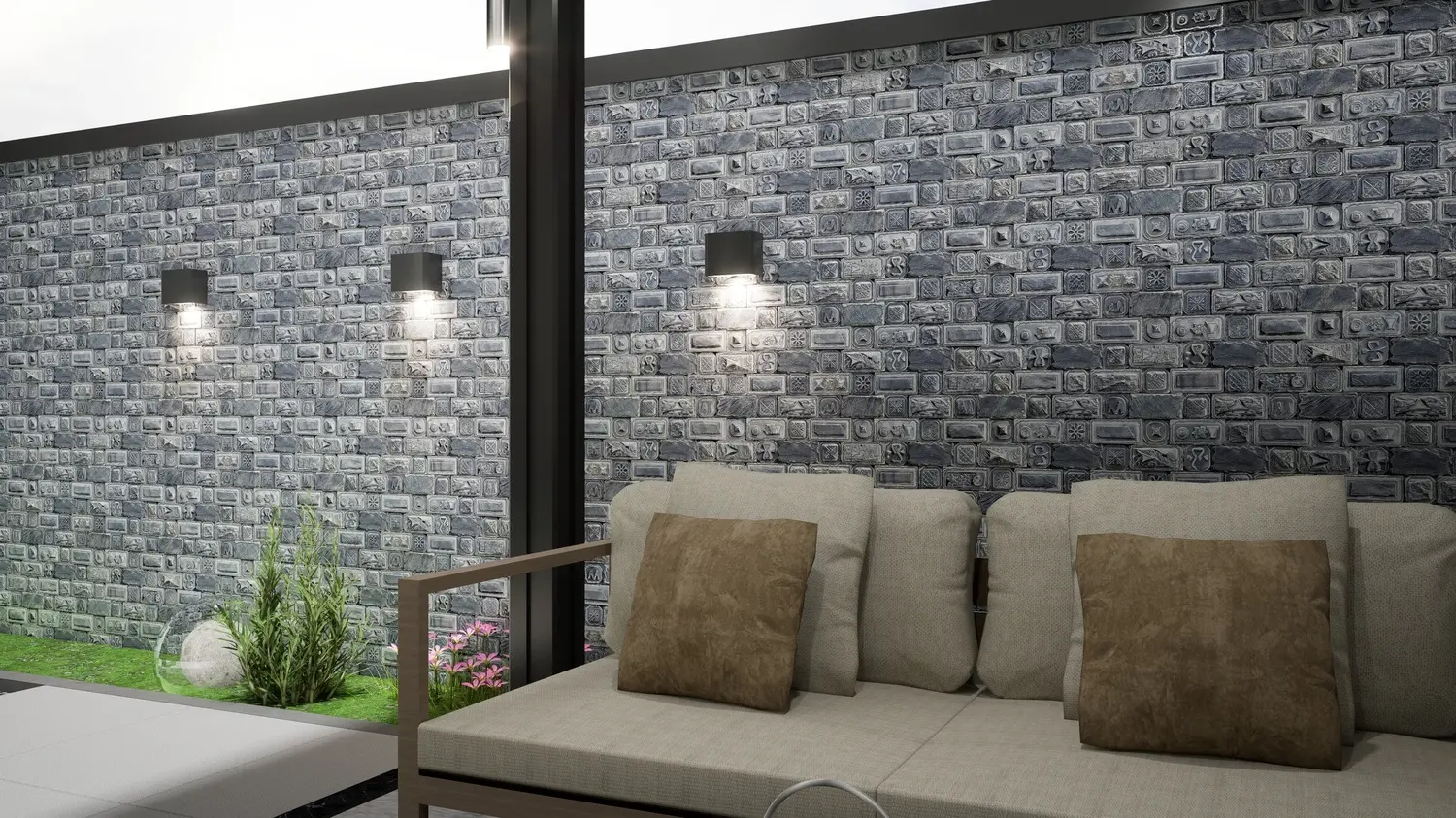
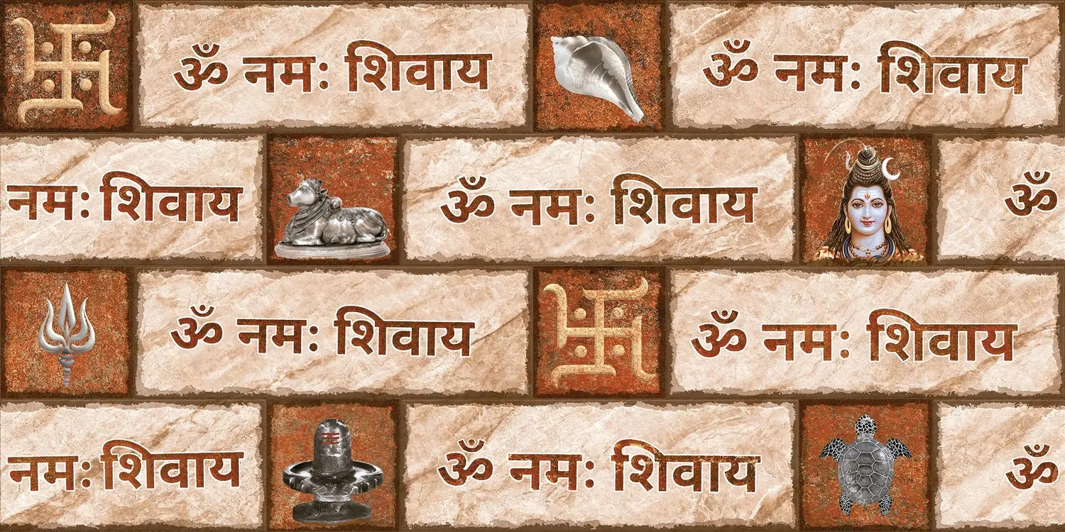
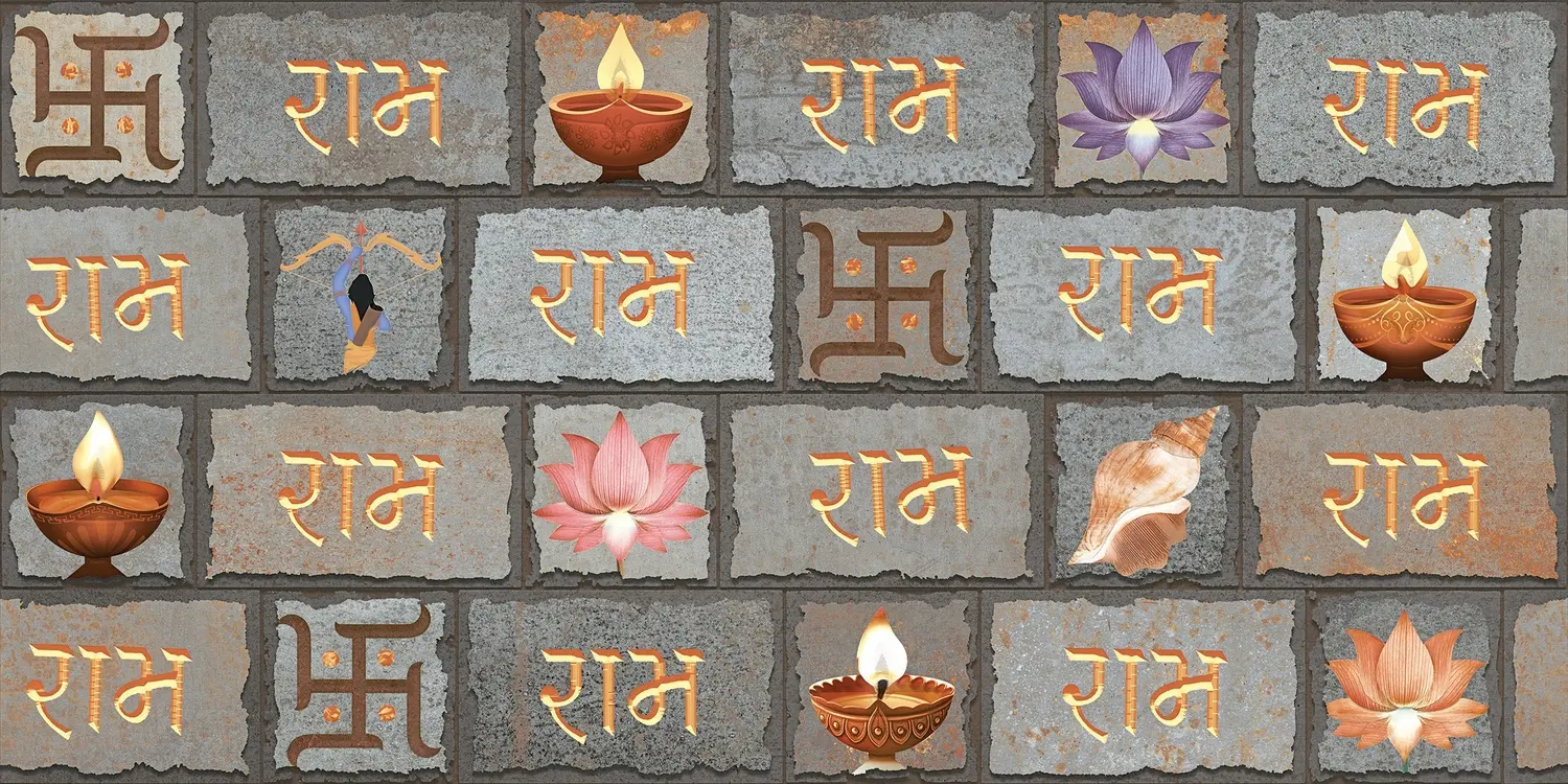
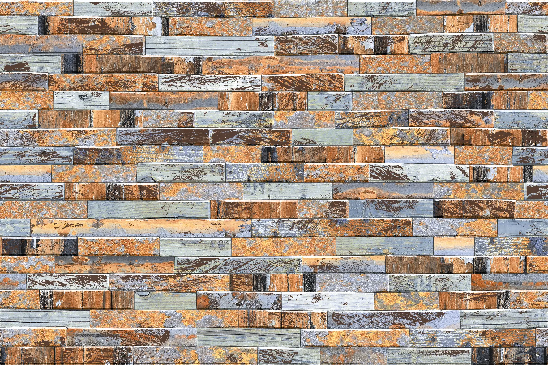
- Brick-block mantra tiles such as Angira Ishvara (Om Namah Shivaya) and Nimohay Raghav (Ram naam) are in warm terracotta, grey and rust tones. They are made for larger temple walls, entrance walls and garden shrines rather than a small north-east niche, where lighter colours are preferred.
Keep sacred motifs on the walls, at or above eye level behind the idols, never on the floor, on steps or in a bathroom. The pooja room tiles guide explains layouts for niches, cupboards and full rooms.
Kitchen tiles as per Vastu
Vastu places the kitchen in the south-east, the direction of Agni, the fire element. The colours suggested are warm: orange, red, pink, peach, saffron and warm yellow, with white and cream as calm alternatives. Black is generally avoided in the kitchen, especially around the cooking area.
- A white or cream backsplash with warm accents is a safe, practical choice: it reflects light onto the counter and is easy to keep clean.
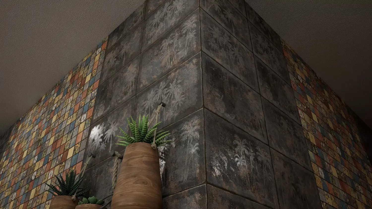
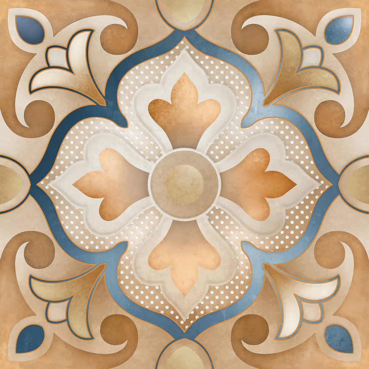
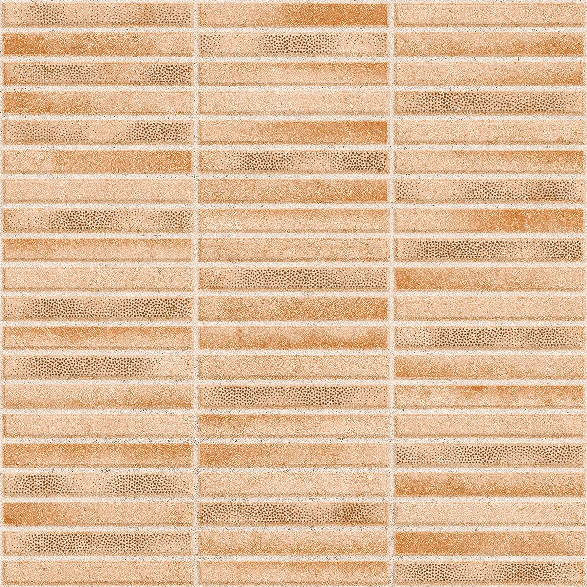
- Warm patterned tiles bring the fire colours in without overwhelming the room. Our Melisa Art Moroccan medallion in soft orange, blue and sand, and Pigmento Beige strips in peach and terracotta, are examples.
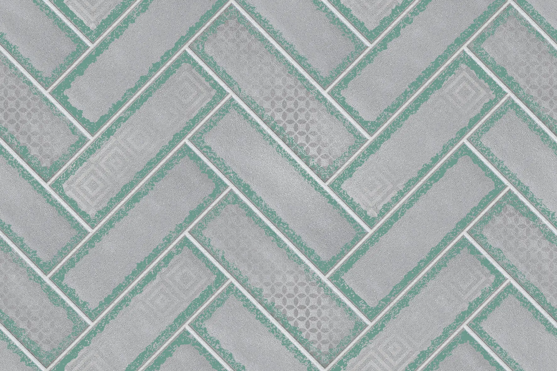
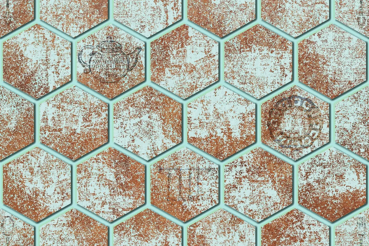
- Green is also considered good in kitchens by many, for health and freshness; our sage Greva Art herringbone and mint Mailono Zapta hexagons suit it.
Because the kitchen is about fire, Vastu advice often suggests avoiding large areas of deep blue or black right behind the stove, as water colours there are said to clash with the fire element. See the kitchen wall tiles guide for practical advice on finishes and heights.
Master bedroom tiles as per Vastu
The master bedroom belongs in the south-west, ruled by the earth element. Colours suggested are earthy and grounding: beige, brown, peach, soft pink, terracotta and warm cream. They are said to bring stability and good relations between the couple. Avoid very bright, loud colours and large areas of black or dark grey in the bedroom.
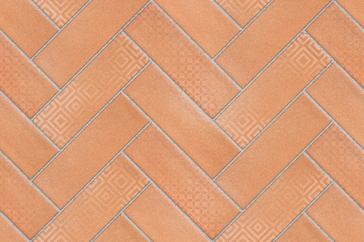
- A feature wall behind the bed in a warm stone or terracotta look suits this direction well: Emola in rust terracotta, Belfist in soft beige stone with floral arches, or Delice Bricks in terracotta herringbone.
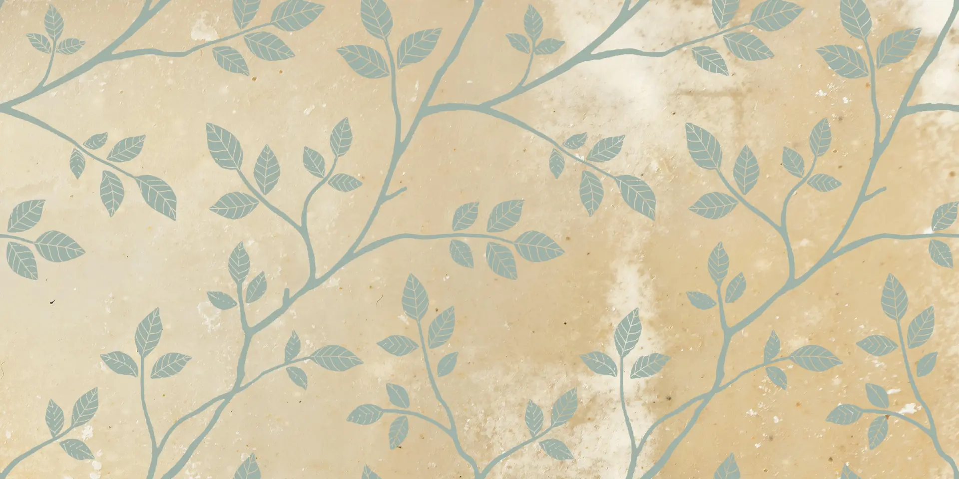
- Soft botanical designs in beige and green, such as Velveno, keep the room calm.
- For children's bedrooms, often in the west or north-west, lighter colours such as light green, light blue and cream are suggested.
Our bedroom wall tiles guide shows where and how to tile a bedroom.

Living room tiles as per Vastu
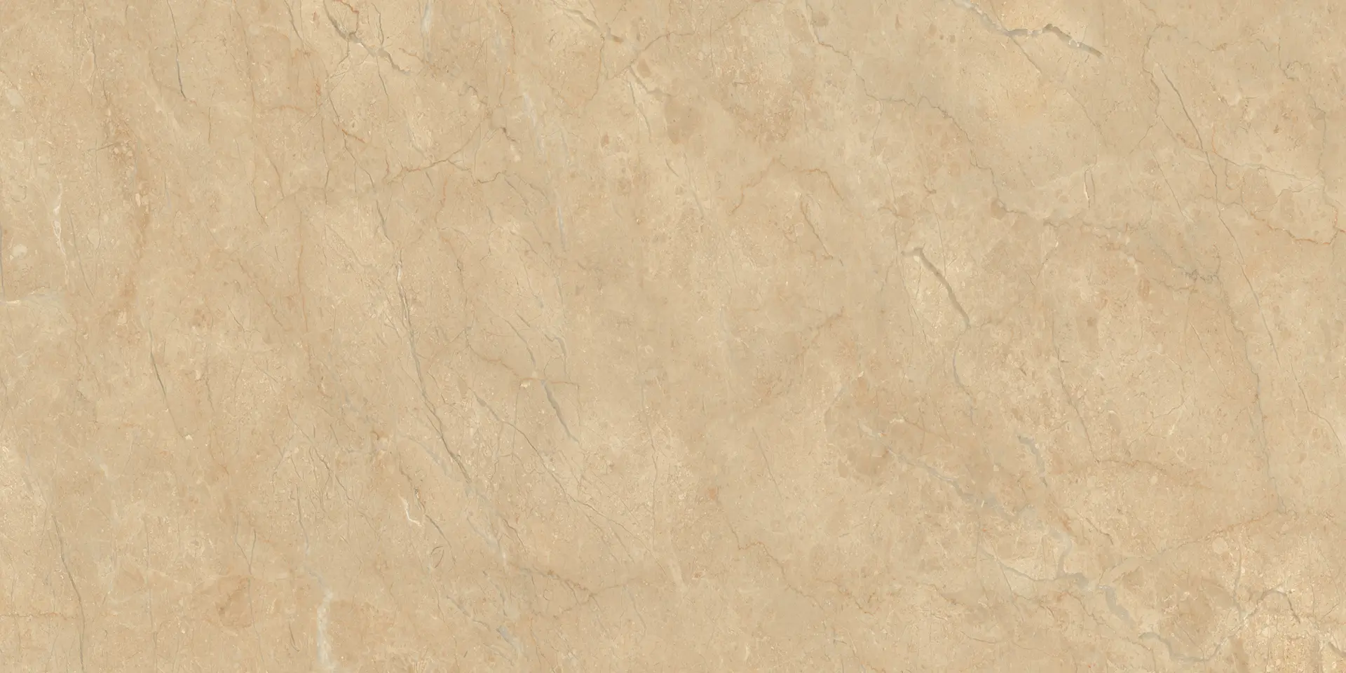
The living room is ideally in the north or east. Light, welcoming colours are recommended: white, cream, beige, light yellow, light green and light blue. A north-facing living room suits greens and blues; an east-facing one suits whites and light greens.
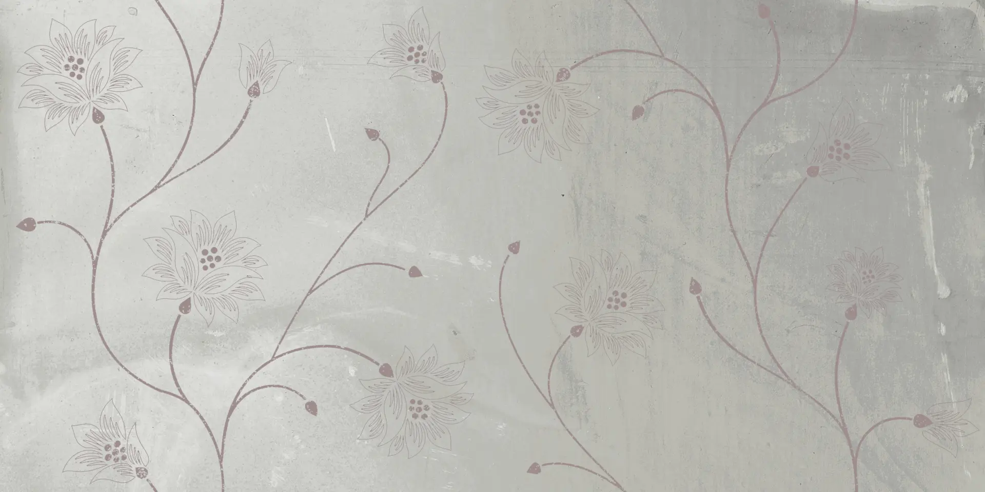
A feature wall behind the TV or sofa can carry more colour and pattern, as long as the overall feel stays light. Light grey and beige botanical sets such as Qubonic and Velveno, or a patterned Moroccan wall in soft colours, work well. Heavy black walls are usually avoided in the living room. See living room wall tiles for designs.
Bathroom tiles as per Vastu
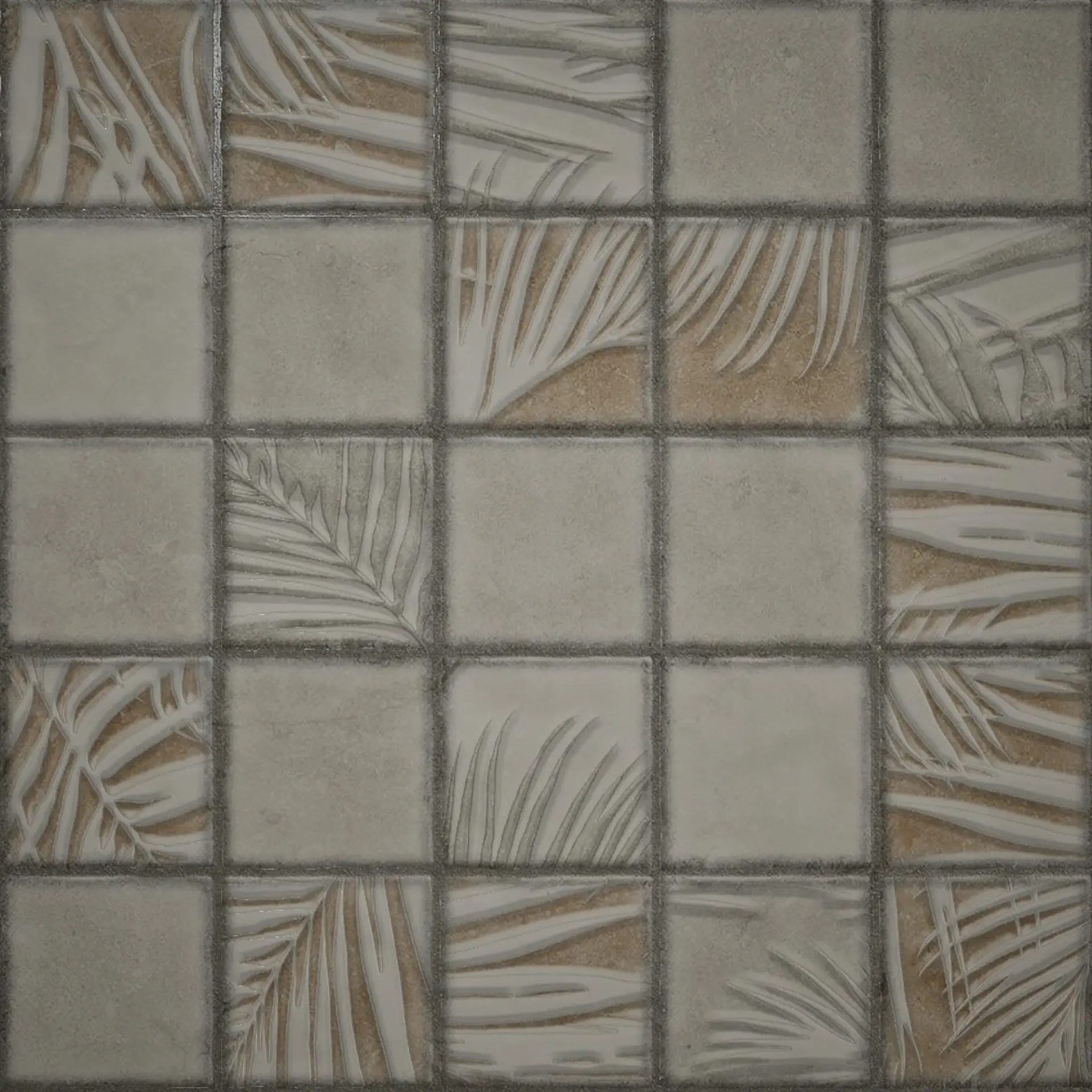
Bathrooms are preferably placed in the north-west or west. Light colours are suggested: white, cream, light blue, light grey and pastel shades. Dark colours, particularly black and dark red, are generally avoided in bathrooms. Light colours also make a small bathroom feel bigger and brighter, which is good design as well as good Vastu.
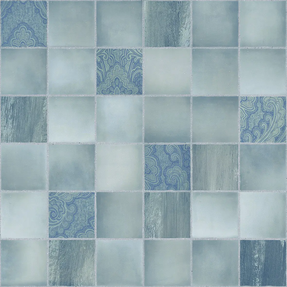
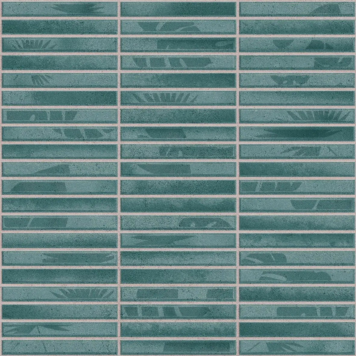
- Light blue and aqua tiles suit the water element: our blue mosaic-look Coliseo Azure and teal Pigmento Aqua strips.
- White, cream and light grey bases with a patterned panel behind the basin keep the room light.
- Avoid devotional motifs in bathrooms altogether.
The bathroom wall tiles guide covers layouts and sizes.
Main entrance and front elevation
The colour of the entrance and the front of the house is usually matched to the direction it faces:
| House facing | Commonly suggested colours |
|---|---|
| North | Green, blue, light shades |
| East | White, light blue, light green, light wood |
| South | Red, orange, brown, earthy tones |
| West | Blue, white, grey |
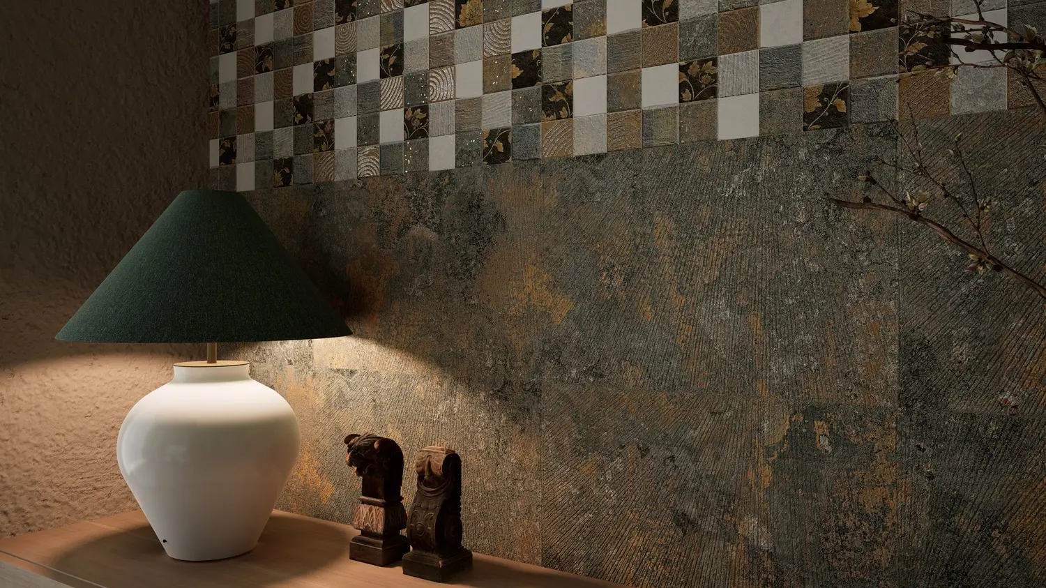
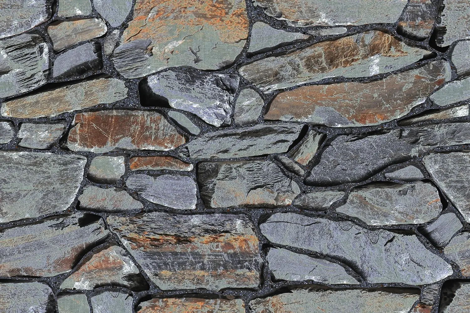
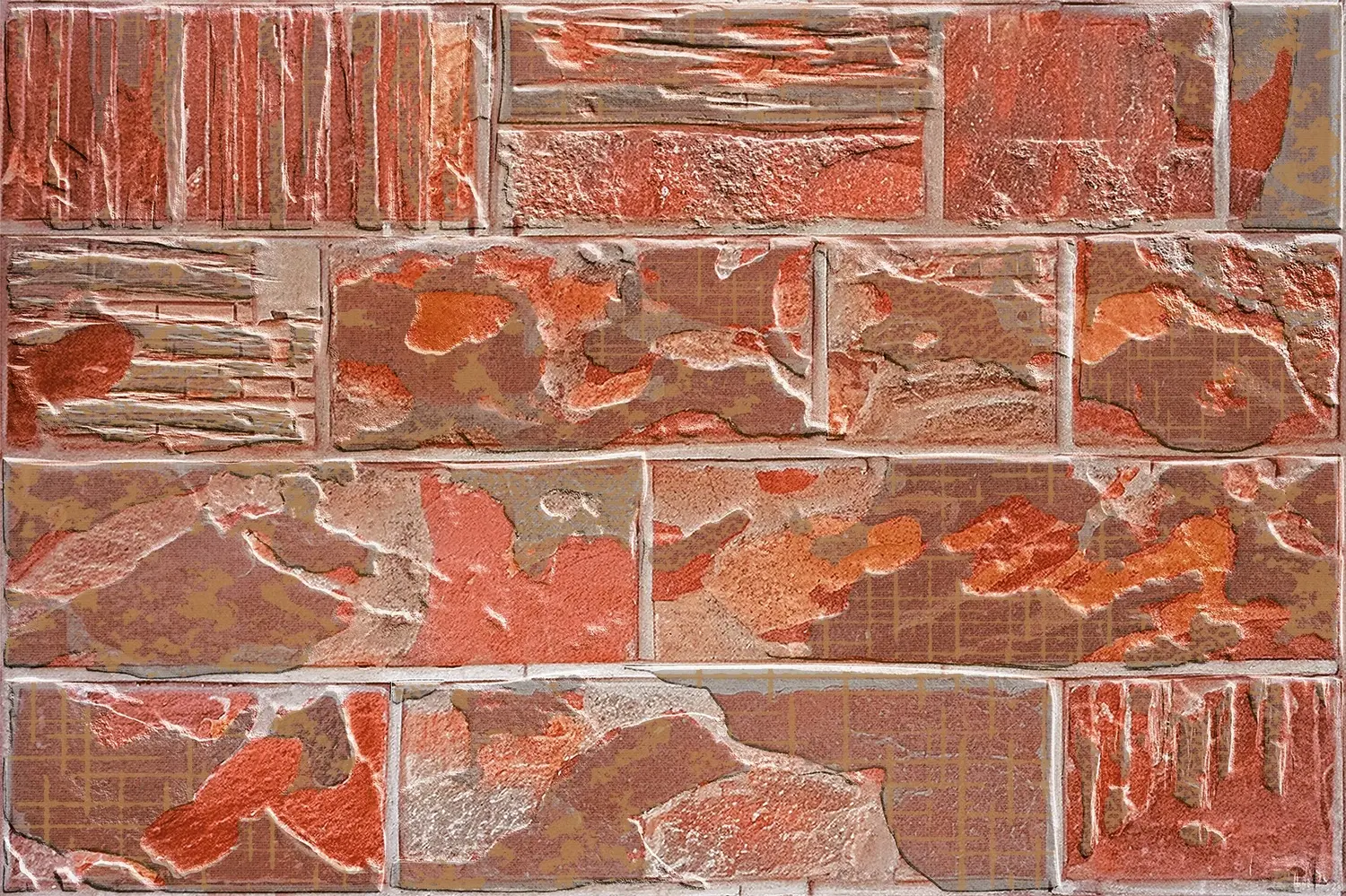
Stone and earthy looks are widely used on front elevations because they suit most directions and weather well: grey slate such as Mudy Stone, red sandstone such as Jaspo Lalie, or ledger stone such as Coprica Pencil. A mantra wall in brick-block tiles, such as Angira Ishvara or Nimohay Raghav, is a popular choice for a gate pillar or a garden shrine wall. See the exterior elevation tiles guide.
Other rooms
- Study and home office. Usually placed in the north, east or west. Light green, light blue, cream and white are suggested, for focus and calm. A soft botanical or geometric feature wall behind the desk, such as Ronda or Chevron, works without distracting.
- Dining area. Often in the west or near the kitchen. Warm, appetising colours such as peach, orange, yellow and light terracotta are suggested. A Moroccan or terracotta-strip wall behind the dining table fits well.
- Staircase walls. Staircases are often placed in the south, south-west or west. Earthy and neutral colours, beige, brown, grey and terracotta, suit these directions; patterned tiles along a staircase wall, such as Stepler Brick or Elton Craft, turn a passage into a feature.
- Balcony and terrace. Balconies in the north and east are favoured, with light colours and plants. Stone-look and terracotta tiles on balcony walls bring the earth element outdoors; see balcony and terrace tiles.
- Guest room. Usually in the north-west: white, cream, light grey and soft pastels.
An example plan for a whole house
Here is how the guidance might come together in a typical home. Treat it as a starting point; your home's layout and your consultant's advice come first.
| Room | Direction | Main colour | Tile idea |
|---|---|---|---|
| Pooja room | North-east | Cream, light yellow, gold accents | Divyam God panel with its beige base |
| Living room | North | White, beige, light green | Velveno or Qubonic feature wall |
| Kitchen | South-east | White with warm orange or peach | Willow Kitchen or Melisa Art backsplash |
| Master bedroom | South-west | Beige, terracotta, peach | Emola or Belfist wall behind the bed |
| Children's room | West | Light blue, light green | Sage Greva Art or a soft pattern |
| Bathroom | North-west | White, light blue, light grey | Light base with an aqua panel |
| House front | Depends on facing | Stone and earth tones | Mudy Stone or Jaspo Lalie elevation |
Floor tiles as per Vastu
General Vastu advice for floors is to choose light, even colours in most rooms, especially in the north and east, and to keep darker or heavier floors, if any, for the south and west. White, cream, beige and light wood or stone tones are the usual choices. Large areas of black flooring are commonly avoided, and so are tiles with images of gods or sacred symbols on the floor, where they would be walked on.
Vastu also places importance on the condition of the floor: broken, cracked or chipped tiles are considered inauspicious and should be replaced promptly. Keep a spare box of every tile for exactly this reason.
Light, cleanliness and finish
Beyond colour, Vastu puts great weight on light and cleanliness: rooms that are bright, airy and kept clean are considered to hold positive energy. Tiles help with both. Light-coloured glazed tiles reflect daylight deeper into a room, and they wipe clean of dust, oil and soot far more easily than painted walls.
Vastu says little about matt or glossy finishes as such. A glossy tile reflects more light, which suits a dark north-east corner or a small bathroom; a matt tile gives softer, even light, which suits bedrooms and walls behind idols, where reflections can distract. Choose by the room, as explained in matt vs glossy tiles, and keep every surface clean and whole.
Colours to use with care
- Black: generally avoided in the pooja room, kitchen and bedroom, and in large areas anywhere. A black and white pattern used as a small accent, such as a bathroom floor or a band, is a design choice many families are comfortable with.
- Dark grey: best kept to small areas and to the west and south-west.
- Bright red: suggested for the south and south-east in small doses; large areas of bright red are said to be too fiery for bedrooms.
- Blue in the south-east: water colours are said to clash with the fire of the kitchen.
Motifs and patterns
Vastu advice is mostly about colour, but a few points about pattern are widely shared:
- Sacred symbols (Om, Swastik, Shree, deities, mantras) belong on walls in the pooja room, entrance or temple wall, never on floors, steps or in bathrooms.
- Nature motifs such as leaves, vines, flowers and trees are considered positive, especially in the north and east. Our botanical and floral tiles are a natural fit.
- Calm, balanced geometric patterns are fine anywhere; very sharp, aggressive or chaotic patterns are usually kept out of bedrooms.
- Water images suit the north and north-east; fire images suit the south-east.
Balancing Vastu and design
Vastu colours and good interior design agree more often than not: light colours in small rooms, warm colours where you cook and eat, calm colours where you sleep. Where your favourite design does not match the Vastu colour of a room, there are simple ways to bring them together:
- Use the Vastu colour for the large areas (base tiles, floors and most walls) and your favourite pattern as a panel or band. Our sets of base and decor tiles are made for this. See highlighter tiles.
- Pick a pattern that contains the colour. Many patterned tiles mix several colours; choose one whose main tone suits the direction.
- Balance with accessories. Paint, curtains and furniture can carry the Vastu colour while the tiles stay neutral.
- Keep sacred motifs where they belong. This matters more to most families than any exact shade.
Tile colour ideas from our range
| Colour family | Axoli designs |
|---|---|
| White, cream, beige | Willow Kitchen, Belfist, Velveno, Qubonic (light grey) |
| Green | Greva Art, Marmi, Mailono Zapta, Velveno (sage leaves) |
| Blue and aqua | Coliseo Azure, Pigmento Aqua, Textura Mist |
| Orange, peach, terracotta | Melisa Art, Pigmento Beige, Emola, Delice Bricks, Stepler Brick |
| Yellow | Bondy Relex (yellow and green herbs) |
| Grey and silver | Jasper, Arritage Square, Mudy Stone, Shiner Craft |
| Earthy brown and rust | Augitoo Art, Coprica Pencil, Jaspo Lalie, Daous Caramel |
| Black (as an accent) | Vienna Black, Porto Fatima, BW 01, Clinker |


Planning a home with Vastu in mind? Send us the room, its direction and the colours your Vastu consultant suggests, and we will shortlist designs. Contact us, or read our guide to wall tile colour combinations.